
By: Eric Parker

Eric Parker lives in Seattle and has been teaching Tableau and Alteryx since 2014. He's helped thousands of students solve their most pressing problems. If you have a question, feel free to reach out to him directly via email.
Tooltips are one of those overlooked features in Tableau that can add so much value. One of my checklist items before publishing to Tableau Server is “Make sure tooltips look okay.” Generally I’m just making sure some wonky calculation I built or some run-on named table calculation isn’t showing up in the tooltip.
However, by spending just a minute or two on a tooltip you can vastly improve it’s curb appeal and value. Below are some ideas you can utilize to spice up your tooltips!
General Values
First, let’s start with the baseline. Adding a few additional values as a helpful reference is a great way to pack more information into your visual without making it feel crowded.

Titles and Subtitles
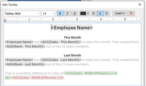
Making the subject of interest a large, bold, centered title, and adding subtitles to break up other sections can help with legibility.

I like to leave the general text in my tooltips as “Tableau Book” but I generally prefer my title to be “Tableau Bold”.
Here’s what a title and some subtitles look like in action.

Sentences
Some users do much better with information when it is presented in a conversational way. Consider changing the standard “one value per line” tooltip default to complete sentences.

When I incorporate sentences into tooltips, I like to keep the values darker and bolded so they still stand out at a glance.
Here’s what sentences can look like in a dashboard.

Color Values Positive/Negative
You can even incorporate colored text values into your tooltips to help drive home messages at a quick glance. Here’s one of my favorite tricks.
I create two calculations, one for a positive outcome (sales increased month over month or at least stayed the same).

And one for a negative outcome (sales decreased month over month).

Notice that in both those calculations, they only return an output when the criteria is met. Because I don’t have an “ELSE” in my IF statement the implicit else is “ELSE NULL”.
I then stack the two calculations side-by-side in the tooltip and make the positive outcome calculation green and the negative outcome calculation red.
For Thomas McAsh, the outcome is negative ($54K decrease).

However, for Sheila Haroldson the outcome is positive ($68K+ increase).

View in Tooltip
And of course no conversation on maximizing tooltips is complete without discussing the View in Tooltip feature.
For instance, in the above visual let’s imagine I’d like to see which 5 items a salesperson is having success selling on hover over. I can create a new worksheet for Top 5 Products and use the Insert dropdown in the top-right corner of the Edit Tooltip dialogue box to bring it into the tooltip.

Remember that if you are using a top filter you will want to go to the underlying worksheet in the View in Tooltip and add the Tooltip filter to context. Otherwise the filter will get passed after the Top 5 filter instead of before the Top 5 filter. Read this blog post if that’s not clear.

Now, when I hover over a bar I get a visual that displays the top 5 products that sales rep sold in the last couple months.

As always, remember to monitor performance closely when utilizing the View in Tooltip feature. It is a great tool but can be a drain on the latency of your dashboard.
Have a favorite tooltip trick of your own that wasn’t covered here? Leave us a message in the comments below!
Want help or advice with designing your own Tableau dashboards? Sign up for an office hour and we’ll spend some concentrated time helping you out!