
If you haven’t had a chance to check it out for yourself yet, I want to introduce you to Tableau’s latest breakthrough, the “viz in tooltip”. Let me show you how this works and why it’s valuable.
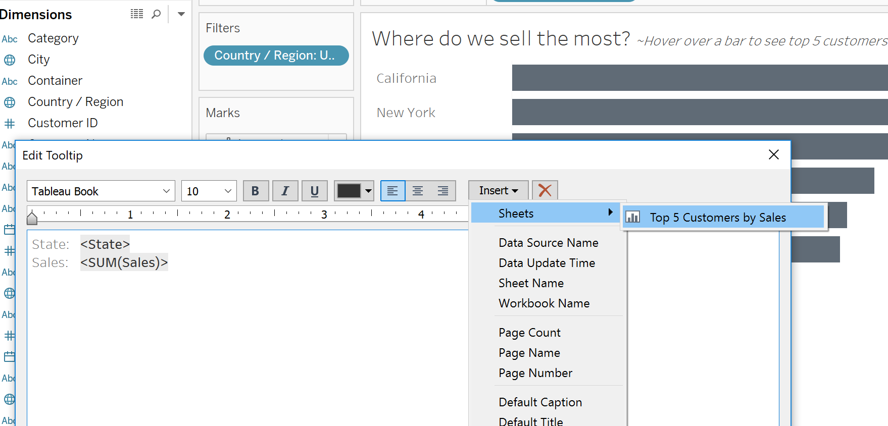
Let’s say we’ve built a chart to see sales by state and would like to hover over a bar and see the top 5 customers in that state. As discussed in an earlier write-up about the Attribute function, when we drop a dimension on tooltip for a chart like this (and there’s more than one value per state) we are going to see an asterisk instead of a list of values.

There is no simple way of getting Tableau to create a list of comma separated values. However, with the viz in tooltip function, we can create a secondary chart the displays a breakdown of those top 5 customers.

Then we can return to the first worksheet and add the second worksheet to the tooltip.
*If you are specifically performing a top filter, you’ll like need to go to the second worksheet and add the tooltip filter action to context so the top filter works appropriately.

Now as you hover over marks in the first worksheet, the filtered version of the worksheet will display in the tooltip, pretty cool!

This is a valuable way of providing supporting information without overwhelming a worksheet or dashboard with unnecessary visual clutter.
Need more help? Sign up for an office hour to gets your problems sorted today!