
By: Eric Parker

Eric Parker lives in Seattle and has been teaching Tableau and Alteryx since 2014. He's helped thousands of students solve their most pressing problems. If you have a question, feel free to reach out to him directly via email.
I’ve always been interested in history. World history, local history, family history, you name it. About a decade ago I spent time researching and building my family tree on geni.com. I had a good experience and it was a helpful resource. I was able to build my family tree far enough back that I found out that (supposedly) I’m distantly related to the explorer Sir Francis Drake and William the Conqueror, king of England. Who knows how reliable family trees are 10 to 25 generations back however, hah!
I got to thinking recently that it would be fun to visualize (part) of my family tree in Tableau. Some of the online genealogy services have some rough visualization capabilities but they are pretty clunky. I looked into examples online and saw some people had created family trees in Tableau, but they didn’t seem super accessible.
Version 1
I started by putting my family tree in Excel where each column was a different generation.
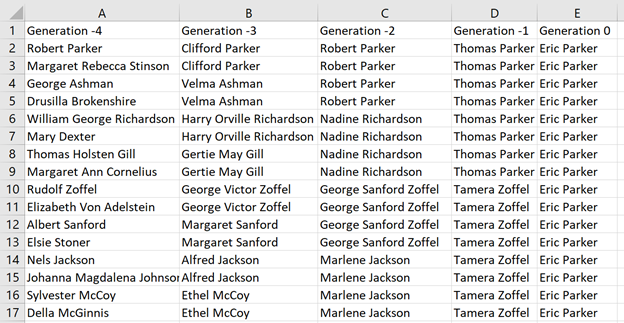
The options for visual output weren’t exciting. Basically just a text table.

Additionally, this method doesn’t allow for adding any additional information about the person listed like when they were born and where they lived.
Version 2
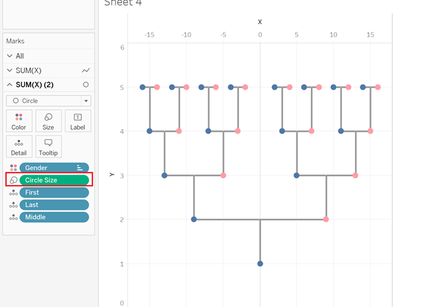
For my next effort I decided I wanted to plot the data more visually. I mapped out some X,Y coordinates for each person so that I could have a more traditional-looking family tree. I even had some lines drawn in to connect married partners. It was an improvement but still not quite what I wanted.
Here’s what the data looked like for Version 2.

Here’s what the visual looked like.

I used shapes to create the circles and leveraged a dual axis chart to create the lines.
This approach allowed me to supplement the names on the family tree with additional information which I vastly preferred.
Version 3
My final version was an expansion of version 2 with additional connecting lines and descriptive information.
I broke the data into two spreadsheets for this version. First, a sheet that has extensive descriptive information and mapping values for each person represented in the tree.

The second sheet provides the lines that serve as the connections between married individuals and children to their parents.

I unioned the tables so that fields like [X], [Y], [Row ID] and [Object Name] were aligned and could be plotted together on a single chart.

The end result looked like this:

I was also able to incorporate more powerful tooltips.

For those curious, I’ll do a quick breakdown below of how I built this.
This biggest challenge was actually the background lines. I leveraged lessons I originally learned in the Tableau Desktop II class and honed in creating the Stadium Seating visual on background mapping.
The steps for creating the background lines (after a lot of back and forth and editing the data) were:
● Set the Mark type to Line.
● Put the [X] field on the Rows shelf.
● Put the [Y] field on the Column shelf.
● Add the [Object Name] field to detail on the Marks card.
● De-select “Aggregate Measures” from the Analysis dropdown on the toolbar.
It initially looked like this:

If you’ve never de-selected Aggregate Measures before this is where you do that.

Now you know why every row of data has a value under [Object Name] in the underlying data.
Now to create the dots, I did the following:
● Put another copy of the [X] field on the Rows shelf.
● Changed the Mark type of the second section of the Marks card to Circle.
● Added Gender to color.
● Added some dimensions to tooltip.

Now I bring the two halves together into a dual axis chart.

Now, you might notice there are circles where the child connects to their parents’ marriage line. That wasn’t ideal.
I wasn’t sure what to do about that at first but decided the easiest approach was to just make the gray circles tiny.
To do that I created a calculation called [Circle Size] that asked for the length of the [Gender] field.

For any circle representing a person, that value would be 1. For any other data point, it would be null.
After adding that [Circle Size] field to the Size section of the Marks card, the gray circles were no longer visible.
From this point to the finished product is just a matter of formatting.

Interact and Build Your Own
The good news is, if you want to replicate this, it should be much easier for you than it was for me! You can interact with and download the Tableau Workbook of my family tree here. You can access a view only version of the Excel spreadsheets screenshotted in this post here on Google Drive. Feel free to download it and swap the values out for your own. I’d love to see the customizations you put to your own family tree in Tableau!
Researching Your Family Tree
If you need help researching your own family tree, I can’t recommend ancestry.com enough. I particularly found their census records useful. The resources that search engine returns now are so much more refined than they were 10 years ago.
For instance, with just a little bit of information (first name, last name, birth place and a place lived) this query on ancestry.com returned to me several helpful census records.

To perform this level of search and see the full results, you do need to have a paid subscription to ancestry. What else do you have going on in winter quarantine though? :)
(Possible) Future Iterations
This might be one of a multi-part series on visualizing a family tree. Some other challenges I have thought about but haven’t dug into yet:
● Represent the members of my Tableau family tree with headshot images rather than blue and pink circles.
● How to flexibly add or remove generations from the tree. For instance, what if I would like to scale this out further and add 3rd Great Grandparents? I would need to encode the needed X, Y coordinates and mapping lines in the underlying data source.
● How to flexibly allow the end users to see more than just direct descent (i.e. what if I would like to see my siblings, aunts, uncles, cousins, etc.). Because the position of the members of the family tree are hard-coded, it would be difficult to build in this level of flexibility.
Hopefully this has been helpful and inspiring! I’d love to help advise you with building your own tree if you want to take on the project. Feel free to send questions my way. I’m always available for extended help on professional (or personal projects) via Office Hours as well!