With a range of courses from Beginner to Advanced levels, our experienced trainers can take your and your team’s Tableau skills to the next level.
Book a consulting session with a Tableau expert to help you solve a technical problem, or to set up one-on-one mentoring to help you up-skill in a particular area.
Big projects are complicated and can require a lot of time. We specialize in building efficient, intricate custom data projects to save you time and money.
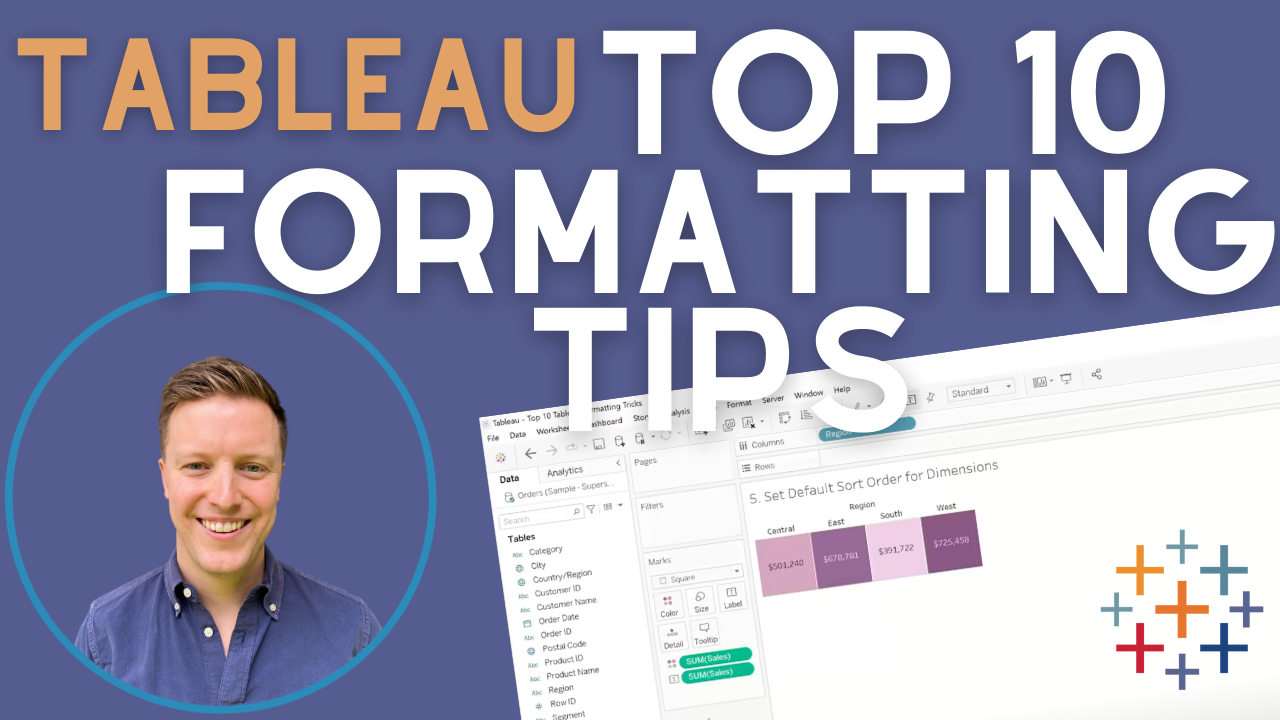
Tableau is a data visualisation and analytics platform that is comprehensive and intuitive to use. Build visually-appealing and insightful graphs and worksheets, compile them in dynamic and interactive dashboards, and share your findings with ease and security. As a market-leading business intelligence platform, Tableau lets you explore and manage your data, as well as share your insights simply with extensive privacy measures.
Who Are We?
The OneNumber team is a small, dynamic group of data professionals, with extensive experience in a range of industries. We believe in building personal relationships with our clients, and getting to know each client’s specific requirements and dreams. We are passionate about teaching and training, solving complex data problems, and about helping you get the most out of your data.
“The OneNumber team has helped us significantly advance our analytical prowess. We can’t thank them or recommend them enough!”
Our Tableau Training Passport gives you access to all our classes over a six month period for half the cost! Come to as many classes as you like, and enjoy up to 56 hours of live instruction with access to class recording for 2 weeks.
Discounted Tableau Training
All our classes, packaged into an unbeatable deal, offering you 56 hours of live instruction from our expert Tableau Instructors.
Client Satisfaction
We’ve taught hundreds of clients over the years, and built many custom technical solutions for many happy clients. Here’s what they have to say.
We want to get as much Tableau information into your hands as possible. Our team has put together a library of free resources to help you learn Tableau. From short videos and posts to answer frequently asked questions, to full-scale video series and classes, we hope that we can add value to your Tableau-learning journey!
The OneNumber Blog
Updated every week, our blog features 250+ posts about various Tableau tips, tricks, and insights to help you gain insights from your data and work with Tableau easily.
Do you need to use Tableau to compare values to an equivalent date from a prior year? For example, "How did sales from this Monday compare to the same Monday from last year?"
This is different than comparing to the exact same date from last year since the comparison is probably 364 days (52 weeks) ago. Additionally, this can be made complicated if there are any gaps in your data. For example, if your business doesn't record transactions on Saturdays, you can't simply use the LOOKUP function to go back 364 days because that would take you back too far. Additionally, if you apply a filter and "lose" days in your data set as a result, the LOOKUP approach will fail.
Have you ever tried to manually change the label color for different segments of your stacked bar chart? It's really tricky! While Tableau has a default color which can be white, black, or white and black alternating, you can't dictate how that should be attributed, and it can't be edited individually.
Here's a fun workaround that lets you control every aspect of the labels in your stacked bar chart from color to size to anything else! We’ll use a dual axis chart (a Tableau workaround hero!), and a reversed axis.
One of the most powerful, underrated features in Tableau Prep is the Difference From or "Multi-Row Formula" function. It allows you to calculate the difference in values between rows of data. This is useful when you need to calculate the time elapsed between dates or the general difference in values (e.g. dollars, counts, temperatures) from one row to the next.
This kind of calculation is only available in Tableau Desktop with a Table Calculation which is limiting because Table Calculations can only execute against data that's present in a worksheet. Pre-calculating differences in the underlying data can be a game-changer!
If you're looking to harness the power of SQL's LOOKUP/PARTITION in Tableau Prep, look no further! Check out this video for a full breakdown.
KPI's are a powerful way to draw our end-users' attention to specific key metrics. By adding in visual information in the form of bar charts, we're able to create a comparison of the current year with the previous year.
While there are numerous ways to show this kind of comparison, here are three easy and effective time-series KPI's that can add an element of visual flair to any dashboard! These bar charts are simple to create and use one or two nifty calculated fields to add the visual flair we’re looking for.
Want to learn how to build a sales funnel in Tableau? You've come to the right place! Most funnels are hard to interpret because they deal with size disproportion issues. The classic upside-down triangle visual likely isn't the best way for you to represent funnel data for your users.
We've built funnels for dozens of clients over the last decade and have distilled our learnings into this video! Check it out for tips on writing calculations, building a funnel visual, formatting effectively and compiling it all into a meaningful dashboard.
KPIs (Key Performance Indicators) are essential for any dashboard, helping you track performance at a glance and make data-driven decisions faster. In this tutorial, I’ll walk you through how to build KPIs in Tableau, from setting up calculated fields to customizing visuals that make your data stand out.
Whether you’re designing a dashboard for executives or optimizing reports for daily tracking, well-designed KPIs can bring clarity and impact. Here’s how to do that in an engaging and eye-catching way!
One of the biggest areas of technical advancement in Tableau Desktop over the last several years is the ability to model complex data sources. Relationships first debuted in 2020 but were only usable for simple data models because you could only use a single fact table as a base table.
In 2024, Tableau updated the Relationship builder to allow for multiple-fact tables and shared dimension tables. This ability is invaluable in complex analyses that leverage numerous tables.
Tableau’s Certifications aim at testing your theoretical and practical knowledge of Tableau through Multiple Choice Questions. The test is designed to give your CV the stamp it needs to show that you know how to use Tableau, and that you’re confident applying theory to reality.
However, many people feel overwhelmed when studying for these exams. Knowing where to focus your attention when trying to study “the whole of Tableau” is a daunting task!
If you want to use Tableau for free and don't need to ensure your data is perfectly private, you can use Tableau Public! This free-to-use option is perfect for Tableau newbies, testers, or people working for organizations where expensive Tableau licenses just aren't possible.
In this video, we'll see how to build a dashboard from scratch: from connecting to data, to building worksheets, to adding actions, and finally, to publishing it.
Our YouTube channel is full of short trouble-shooting videos, deep-dives into various topics, and full-length webinars and workshops on Tableau topics. We release multiple videos a week, aiming to answer your Tableau-related questions and give you tips and tricks that might take months to learn!