
By: Eric Parker

Eric Parker lives in Seattle and has been teaching Tableau and Alteryx since 2014. He's helped thousands of students solve their most pressing problems. If you have a question, feel free to reach out to him directly via email.
*June, 2023 Update:
Please note that Tableau has a new feature to allow for multiple types of lines in a single worksheet. The below is relevant to Tableau 2023.1 and earlier.*
—-
Tools like Excel and Google sheets give you the ability to create line graphs which can distinguish lines not only with different colors, but with different shapes. You can see in the chart below there is a yellow solid-line, a red dashed-line and a blue dotted-line.

Unfortunately, Tableau doesn’t offer that same capability. Below is an image of how close I have been able to get to recreating something similar to the above image (within a single worksheet).

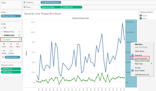
We have the solid line, square line and the dashes. I’ll walk through how I did this.
Using Superstore data, I started by putting Month or Order Date on the Columns Shelf and Sales on the Rows shelf.

Notice that I converted Date Value Month of Order Date to be a Discrete field. That is important and will come into play in a little bit.
Next, I dropped the Profit field onto the Sales axis to create a shared-axis line graph.

The result looks like this.

After that I dropped another copy of Profit to the right side of the visual to create a dual axis chart.

The result looks like this.

By changing the mark type of the Profit section of the Marks card to square and then synchronizing the Profit axis to the other axis, I get what appears to be a line graph with squares for the data points.
The third “line” I added (orange dashes) was done with reference lines. That’s why it is so important to have the Month value be discrete.
I added the field (Cost of Goods Sold) to the Marks card, right-clicked on the Value axis, and added the reference line with the following settings.

After some formatting steps (hiding right axis, removing title from left axis, changing number format for left axis, customizing date format, customizing title) I have my finished product!
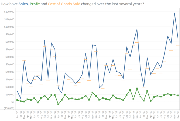
I did also play with the idea of using the reference lines as “squares”, replacing the squares on the green line with circles, and adding a proper line for the Cost of Goods Sold measure but felt it was too busy for this example.

That is as close as I know how to replicate that capability from Sheets/Excel lines. Drop a comment below if you have a more elegant solution!
Need help working through your own Tableau questions? Feel free to fire me and email or sign up for an Office Hour to supercharge your project!