By: Eric Parker
Eric Parker lives in Seattle and has been teaching Tableau and Alteryx for 5 years. He's helped thousands of students solve their most pressing problems. If you have a question, feel free to reach out to him directly via email.
Need help with your Tableau dashboards? Sign up for an office hour to work with Eric! Want to dive deep into Tableau? Check out our upcoming Tableau classes!
—
One of my favorite additions to a dashboard are summary tiles. They’re a great way to quickly communicate a few quick, important data points. In this write-up, I’ll share some of my favorite techniques for building them and making them look crisp. See below for an example of summary tiles I created recently.
Creating Summary Tiles
1. Create a new worksheet. Each of the summary tile in the dashboard above are individual worksheets.
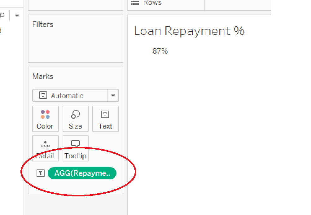
2. Drop the relevant measure on “Text” in the Marks Card.
3. Select “Text” in the Marks Card and hit the “...” to edit the text. Label the measure and bump the size of the measure up.
4. Select “Text” again and center the alignment of the text.
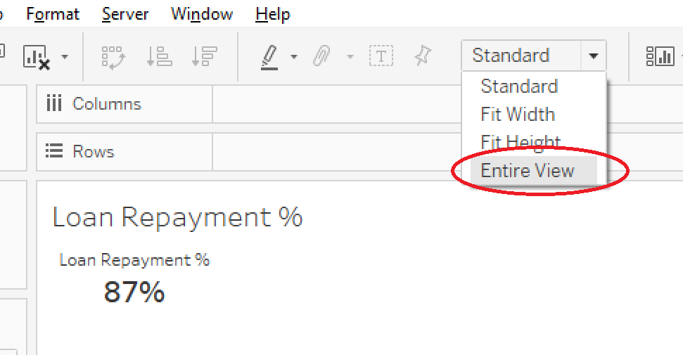
5. Set worksheet to fit the Entire View.
6. Select “Tooltips” in the Marks Card and deselect “Show tooltips” and “Include command buttons”.
7. Change the background of the worksheet to be light-gray. I usually pick the lightest gray possible. This helps it stand out against a white dashboard background.
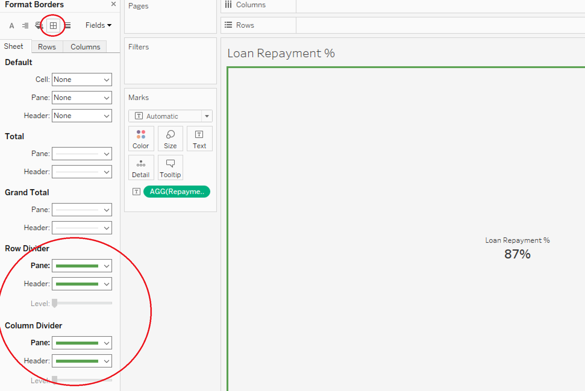
8. Add colored borders to the summary tile if the same measure is being used in other parts of the dashboard. This visual cue will help your end user create a relationship between the two.
9. When you add the summary tile to the dashboard, hide the worksheet title and make sure all relevant filters are applied to the worksheet.
Enjoy what you read? Check out our follow-up post on how to add arrows and make summary tiles change color!
Need more help? Please contact us at freesupport@onenumber.biz.


