
I shared an example with a class recently about how to use Table Calculations in Tableau and got a request to share this via a write-up. One of the most powerful things about Table Calculations in Tableau is the ability to set a scope and direction.
In the example I shared with the class, we started with a dataset showing the average yearly cost of tuition and fees at a four-year college for different states. It looks like this:
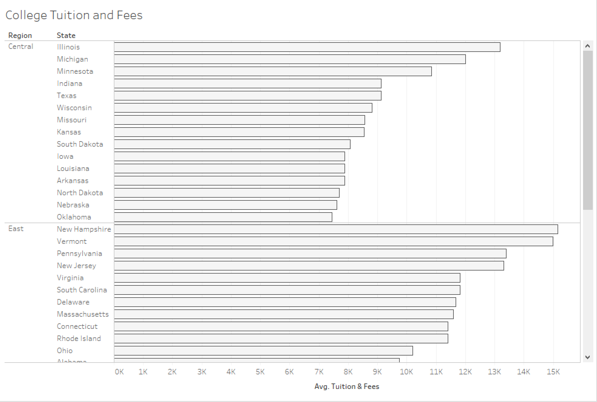
We started by looking at each state’s difference from the overall average. I’ll walk you through the steps needed to do this.
1. Build a reference line showing the average of Tuition and Fees across all states.

2. Create a calculation to calculate the average of a single state from the average of all states.

Notice the use of the WINDOW_AVG() function above. This function allows you to take an average of all the points in the “window” (worksheet).
3. Add the calculated field to Columns.
4. Right-click on the calculated field in the view and select “Edit Table Calculation” to ensure that the scope and direction are set at “Table (down)”

5. Change the color of the bars to match the color of the reference line. The outcome will look like this:

ow, if you want to create a comparison to the regional average side-by-side with the comparison to the overall average, here are the steps to do that.
1. Add a reference line to display the average regional Tuition and Fees.

2. Add another copy of the calculated field created before to the Columns shelf.
3. Right-click on the second calculated field in the view and select “Edit Table Calculation” to ensure that the scope and direction are set at “Pane (down)”
4. Change the color of the bars to match the color of the reference line. The outcome will look like this:

5. Change the Axis titles so that a user will know the difference between the different measures.

This can be a powerful addition to analysis because it provides more context for the end user. For instance, we can see from the image below that Ohio’s Tuition and Fees are higher than the national average but slightly below the regional average.

Need more help? Please contact us at freesupport@onenumber.biz.