
By: Eric Parker

Eric Parker lives in Seattle and has been teaching Tableau and Alteryx since 2014. He's helped thousands of students solve their most pressing problems. If you have a question, feel free to reach out to him directly via email.
In the Tableau world, donut charts sometimes get a bad reputation just like pie charts. The reason basically boils down to humans being less adept at comparing angles of a circle than length or a line or bar. That said, I have a soft spot (pun intended) for donut(s) (charts).

They work best when the measure has a scale with a definite end point and the values can’t be negative.
A few examples:
● What percent out of 100 did each student receive?
● What was the average response 0-10?
● What percent of our goal did we meet? (this one can be a little tricky if the value goes above 100%).
I am going to use Profit Ratio with the Superstore data set for my examples. Profit Ratio is a great field for use in a donut chart because although it can go negative, that’s unlikely and the value can’t exceed 100%.
If you’re trying to build along, this is the Profit Ratio calculation I’ll be using.

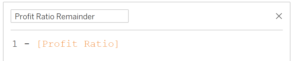
The first thing we need to build is the pie chart that sits in the background of the donut chart. In order to build this I will need one more calculation, “the remainder”. What I mean by that is if Profit Ratio is 70% the remainder if 30%.
Here’s what that calculation looks like.
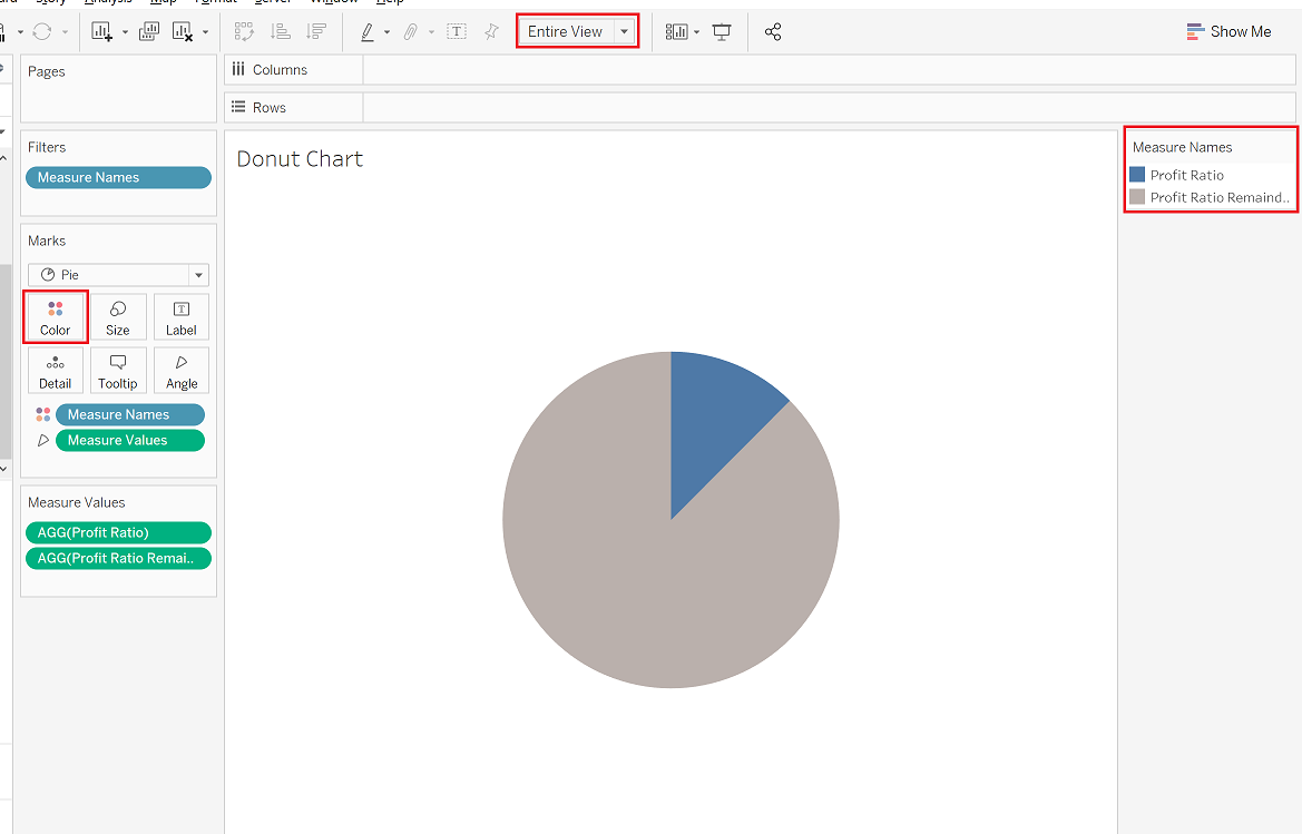
Now to build the pie chart. It requires the following steps:
● Set the Mark type drop-down to Pie.
● Add the Measure Values field to Angle on the Marks card.
● Add the Measure Names field to Color on the Marks card.
● Filter on Measure Names to keep only [Profit Ratio] and [Profit Ratio Remainder] in the worksheet.

I’m going to make a couple other tweaks as well like setting the worksheet fit to Entire View and changing the mark colors.
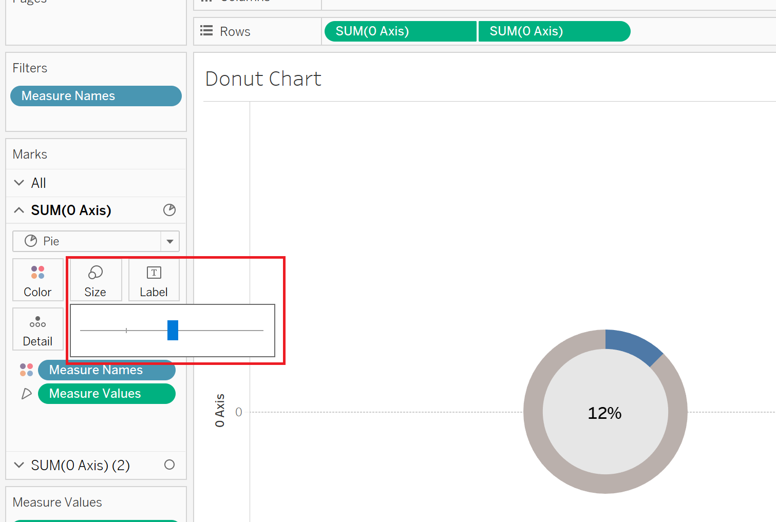
To layer a smaller circle on top of the donut with the Profit Ratio % on label, we’re going to need to create a dual axis chart.
The first step is to create a calculation which will give us an axis.

I like to use 0 so I don’t have to mess around with aggregation. The SUM, AVG, MIN and MAX of 0 is always 0.
Next, we can drag the [0 Axis] field to the Rows shelf twice. That gives us two different sections of the Marks card which we can edit independently.

Now you can go to the second section in the Marks card, set the mark type to circle and remove all fields from the Marks card.

You can use the Color tab of the Marks card to change the circle color and then add Profit Ratio to Label and customize the text size and alignment.

Then, you can right-click on the second [0 Axis] field on the Rows shelf and select “Dual Axis” from the drop-down so the circle lays on top of the pie chart.

You’ll likely need to do some resizing in the Pie and Circle sections of the Marks card to get the look and feel you want.
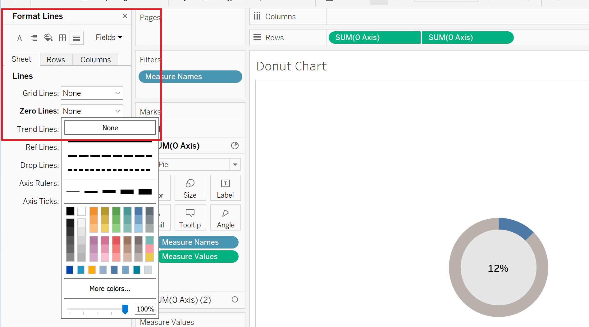
From that point forward, it’s all formatting. You should hide the [0 Axis] headers (right-click on the axes and deselect “Show Header”) and remove zero line (both done in the formatting window).
If you want to add a dimension to the Rows or columns shelf, that works too.

Interested in taking donut charts even further? Check in next week to learn how you can add a reference line to a donut chart and change the color of the donut based on whether the goal is met.

Need help building your own visuals? Reach out or book an office hour and we’ll help you get rolling!