
By: Eric Parker

Eric Parker lives in Seattle and has been teaching Tableau and Alteryx since 2014. He's helped thousands of students solve their most pressing problems. If you have a question, feel free to reach out to him directly via email.
If you haven’t built a donut chart or read my previous post on donut charts, you’ll want to do that now before continuing.
Warning! Proceed at your own risk. Before I go any further I should say that this is going to be a wild post with a lot of moving parts. I think a donut chart with a reference line is a really fun and different visual, but it’s only going to work in select circumstances.
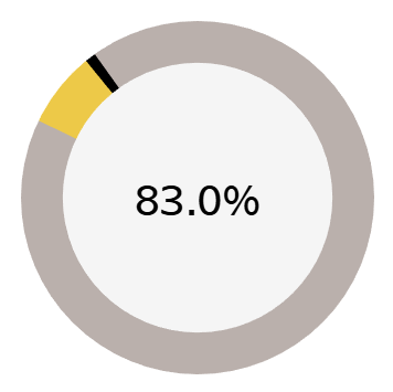
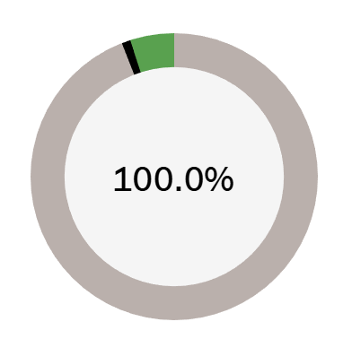
Here’s an idea of what this can look like.
I like to have the unfinished portion of a donut show up as red or yellow if a goal isn’t met.
On the other hand, if the goal is met I like the portion that exceeded the goal to show up as green or blue.
We’ll get into the full details of how to build out these donut charts. This is going to require a number of calculations so buckle up.
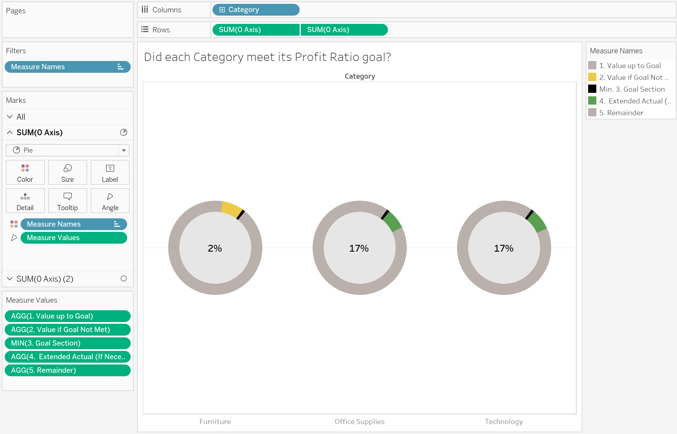
First, we need to define what the goal is. This can be a static value or based on a field from the data source. For this example, I will hard code a goal.

I’m going to use Profit Ratio as the metric that drives the donut chart like in the previous blog post and set a goal of 10%.
Now, there are 5 calculations which are going to go into making the donut chart.
1. Value up to Goal
This section returns either the actual up to the goal or however high the actual was if it didn’t meet the goal.

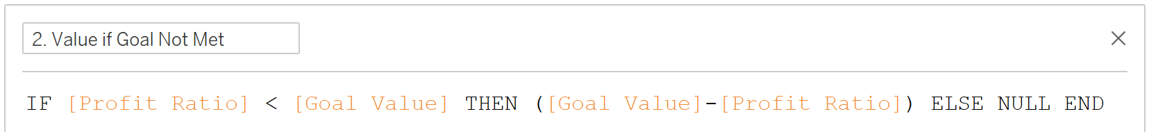
2. Value if Goal Not Met
This section returns the space between the actual and goal if the goal wasn’t met.
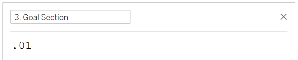
3. Goal Section
This section returns what will become the reference line in the donut chart.
4. Extended Actual (If Necessary)
This section returns the actual value beyond the goal if the goal was met and exceeded.

5. Remainder
This section returns however much of a remainder there was after the actual or goal and the end of the donut chart.

Using a similar process to the previous post, build a pie chart in the background with a circle in the foreground to have a donut visual. On the donut, ensure only the five measures we just created are on the Measure Values card.

Ensure the aggregation for the [3. Goal Section] calculation is set to MIN otherwise it will duplicate and the goal section won’t be a simple, small sliver.
After some color formatting, this visual is ready for prime time!
Special thanks to this post on the Tableau Community Forum which laid out the general approach for how to accomplish this.
You can access a version of the Tableau workbook from this walkthrough on Tableau Public here.
Need help building your own visuals? Reach out or book an office hour and we’ll help you get rolling!