By: Eric Parker
Eric Parker lives in Seattle and has been teaching Tableau and Alteryx since 2014. He's helped thousands of students solve their most pressing problems. If you have a question, feel free to reach out to him directly via email.
There are a number of scenarios where you may want to build a dashboard that anonymizes the names/personalized information of everyone except the active user.
Here are a few possible scenarios:
● How is one salesperson doing compared to their peers?
● How is one teacher’s students performing/improving compared to their peers?
● How much money one person has donated compared to others.
For this blog post, I’m going to outline how to create a dashboard which lets you rank and compare salespeople in your organization. To protect peoples’ identities, we will only let an active user identify their own standing without giving them any personalized info about their peers. The way the data is structured, this will only work on Tableau Server or Tableau Online.
The key to being able to make this work is to ensure that you have your users’ Tableau usernames. Oftentimes they will register with their email address but if you have an internal Tableau Server, they may have registered their account using Active Directory or some similar process.
The USERNAME() function in Tableau pulls a user’s username when they are logged into Tableau Server or Tableau Online. We can write a calculation which allows a user to identify themselves when viewing the dashboard.
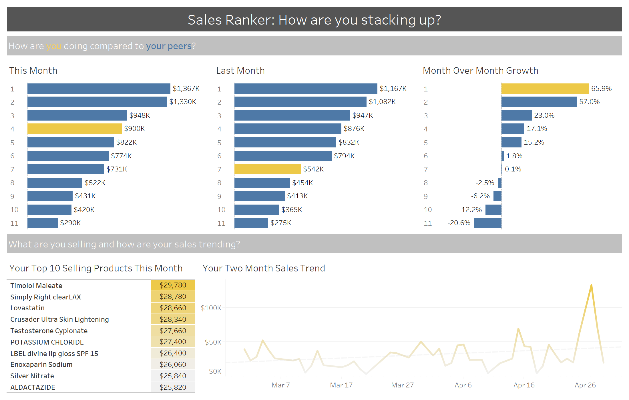
I’ve used that calculation on the Color tab in the Marks card on many worksheets in the above dashboard so an end user can identify themselves. Notice that I’m logged into my Tableau Online instance already (bottom-right of the below image) so Tableau is only highlighting the one bar associated with my username.
Another trick I’ve utilized is putting the Employee Name in each worksheet but hiding that column.
You’ll notice there is a Rank column at the beginning of each bar chart. That can help someone understand how they’ve done compared to their peers.
If you look really closely, you’ll notice that I’ve just hand-filtered the above worksheet to April 2020 for “this month”. If you want to make filters like that dynamic, you can use logic similar to that utilized in this OneNumber blog post: Month to Date vs. Previous Month to Date.
Three keys to ensuring the data stays anonymous are;
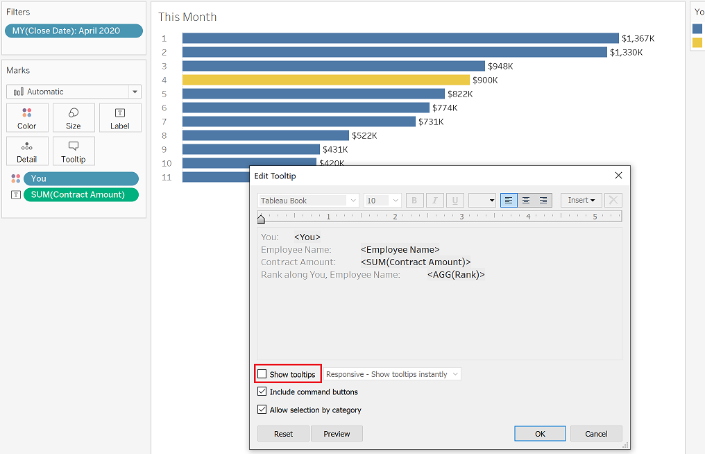
1. Remove all tooltips.
2. Hide any sensitive fields that you can.
3. When publishing, remove everyone’s ability to view the underlying data, download the workbook/data, or make any edits.
Once you’ve done that, you should be ready to publish your anonymous comparison tool! However, be careful to do rigorous testing to make sure no sensitive information has slipped through the cracks.
Need help building your own calculations or customizations? Reach out or book an office hour and we’ll help you get rolling!


