
By: Eric Parker

Eric lives in Seattle and has been teaching Tableau and Alteryx since 2014. He's helped thousands of students solve their most pressing problems. If you have a question, feel free to reach out to him directly via email.
One of the challenges of busy dashboards in Tableau is that it can be hard to tell if a filter has been applied. Consider a dashboard like this where the filters are subtle and in the top-right corner.

An inexperienced user might easily miss which filters are applied.
One way to make that more obvious is through the use of dynamic subtitles.
Check out this example with no filter applied:
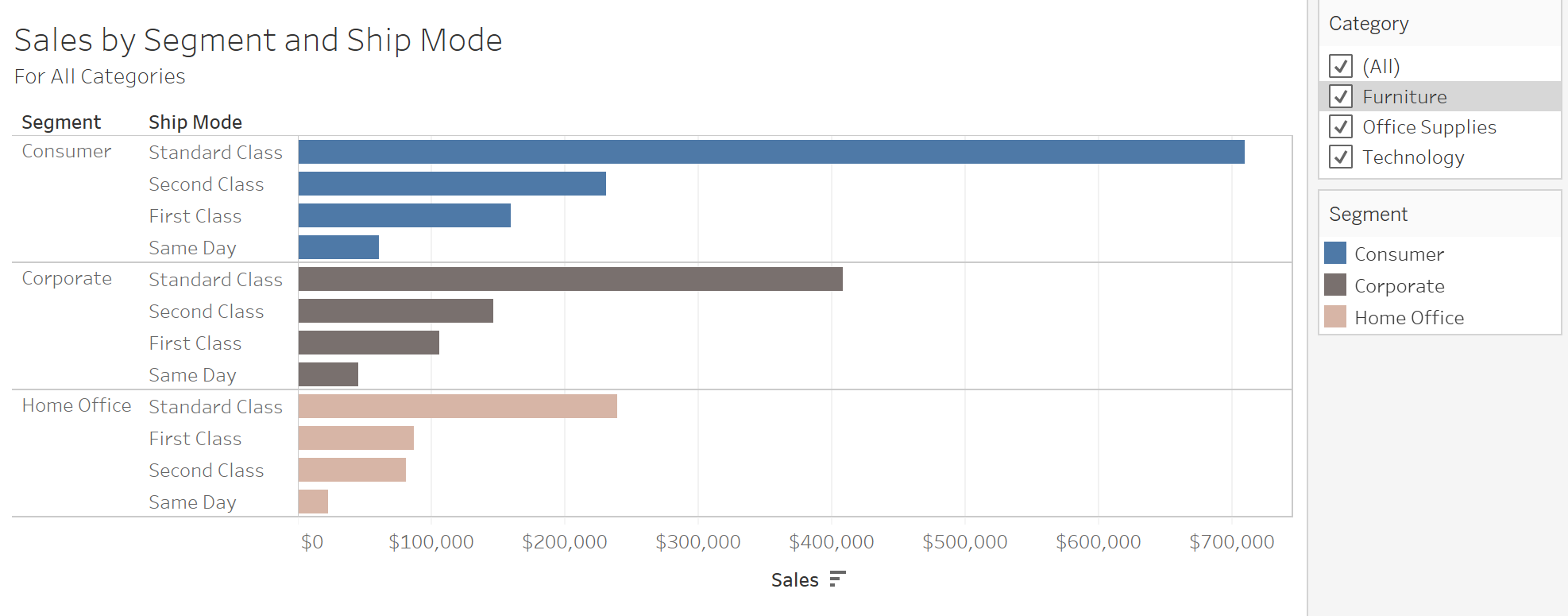
Compared to when a filter is applied:

Notice the bright orange text in the subtitle.
The trick to pulling this off is to create two separate calculations which are stacked next to each other in the title (similar to the method discussed in the color changing labels blog post).
The first calculation returns a value for when all categories are selected and otherwise returns a blank.
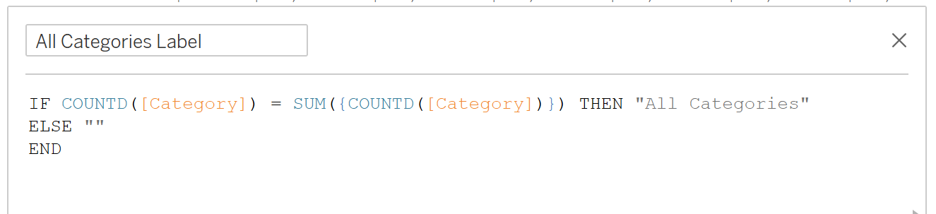
You might be wondering, what’s going on in this calculation? Why are there curly braces around COUNTD([Category]) on the right half of the equation? We are using a FIXED level of detail calculation to tell Tableau to check if the number of categories present in the worksheet matches the number of categories in the data source. (Check out this blog post if you want to read up more on that.)
The second calculation can return either a single category name or the generic “Multiple Categories Label”. It looks like this:

The first line uses MIN and MAX to determine if there is only one category selected. If that’s the case, it returns the category name (along with some other text). The second line ensures that if all categories are selected, a blank is returned (because that scenario is already covered by the previous calculation). The third line covers all other scenarios (in this case, when 2 categories are selected).
To be able to use these calculations in the title, they need to be on the worksheet. I usually put them on Tooltip in the Marks card.
Here’s what editing the title will look like (the fields can be inserted using the Insert dropdown in the top-right corner of the Edit Title dialogue box).

And here it is in action:

Remember to clean up the tooltips so these calculations don’t show up when hovering over a bar!

This method works great for Category because it isn’t otherwise being used in the worksheet. If I wanted to use the same approach for the Segment or Ship Mode fields (currently on the Rows shelf), I would need to put create this custom title in a separate worksheet (check out this blog post to learn more about that).
Thanks as always and feel free to reach out or book an office hour if you have something you’d like to work on together!