Showing the relationship between two values over a variety of categories or time periods is always a challenge.
Stacked Bar Charts:
Combined Axis Line Graphs:
Scatter Plots:
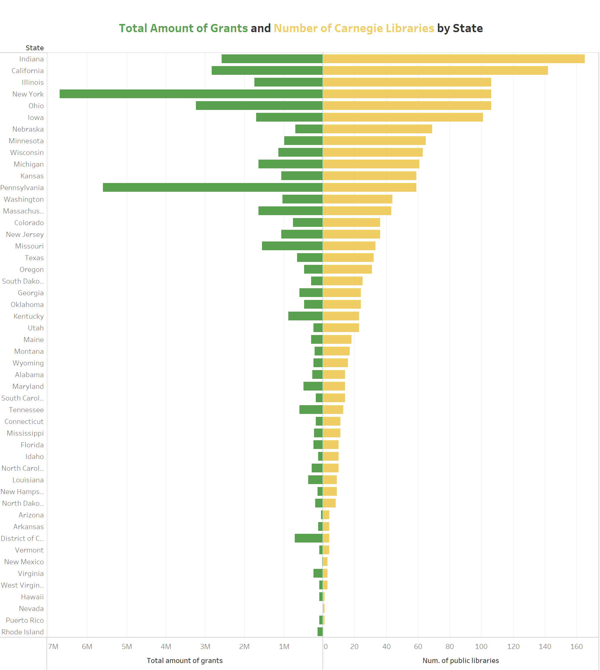
Here’s an alternative designed by a student of mine. He was given a worksheet that looked like the one below and asked to make the visual more intuitive so end users could better understand the relationship between libraries and grants.
Generally people opt for a scatter plot, but he took a different route:
Notice how the states with high values jump out and how easy it is to spot anomalies. Here’s how you build this chart.
Build a normal side-by-side bar chart:
Right-click on the first axis and check the box next to “Reversed” under Scale.
The chart type is named in honor of that student, nicely done Bourke!


