By: Eric Parker
Eric Parker lives in Seattle and has been teaching Tableau and Alteryx for 5 years. He's helped thousands of students solve their most pressing problems. If you have a question, feel free to reach out to him directly via email.
A student recently asked me how she could create dynamic, color-changing labels based on whether a field passed a threshold. My first response was “Tableau can’t do that.”. My second thought was “How can I make Tableau do that?”. Here’s an example of what she wanted to create:
To create a tree map that looks similar to the one above, check out this blog post.
Creating Color-Changing Labels
1. If you’re following along with Superstore data you’ll first need to create a Profit Ratio calculation. Here’s mine:
2. Create a treemap based on the top-10 items by sales.
3. To make the Profit Ratio text change colors we’ll actually need two calculated fields. Those are:
and
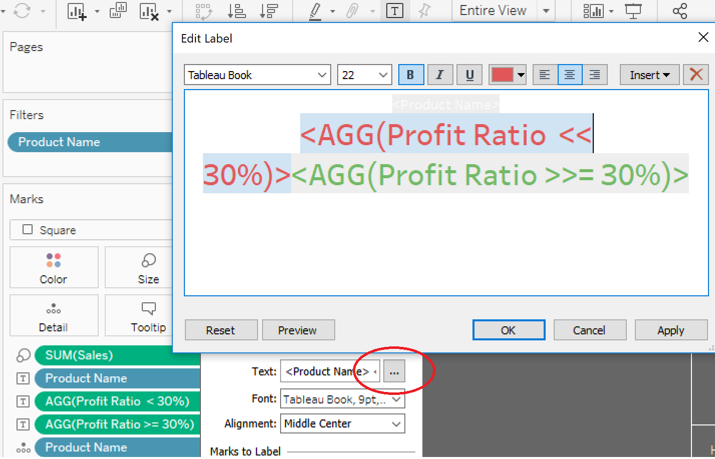
4. Drop both of these new calculations on “Label” in the marks card.
5. Select “Label” in the marks card to customize the text being displayed. Ensure that both fields are side-by-side. You can color one green and the other red.
6. Admire your sorcery! Notice that only one of the two fields shows up at once. The way we set the calculations up, a value will only be returned if the condition is met. If the condition is not met, Tableau returns a null (blank).
7. If you want to create a custom legend like you see above, check out this post.


