
Tree maps are a data visualization used to communicate hierarchal values in a systematic way with nested rectangles. A lot of the tree maps I see look something like this:
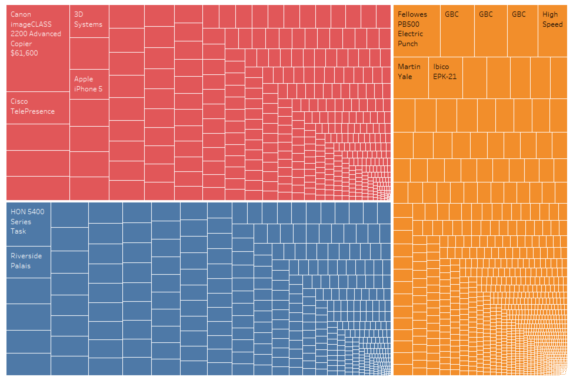
I don’t know about you, but I don’t find this to be particularly informative or compelling. I prefer to use tree maps as a way to highlight a few relevant data points. Notice in the dashboard below how I use a tree map to highlight the top 10 items sold.

I’ll walk you through how I build something like this.
Building a Top 10 Tree Map
For this example, I’ll be using superstore data. Feel free to follow along to learn if you’d like.
1. Create a new worksheet, change the mark type (in the Marks Card) to square and drop the “Product Name” field on “Detail” in the Marks Card.
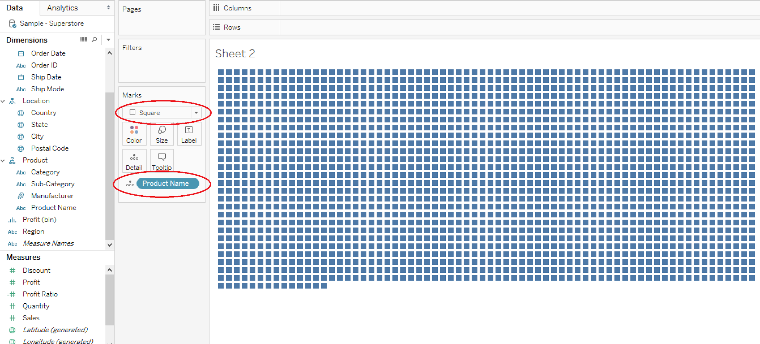
2. Drag a measure (in this case “Sales”) to “Size” on the Marks Card and change the worksheet fit to “Entire View”.

3. Drag a copy of the “Product Name” field to the Filters card and create a top 10 filter based on Sum of Sales.

4. Drag copies of the “Product Name” and “Sales” fields to “Label” on the Marks Card.

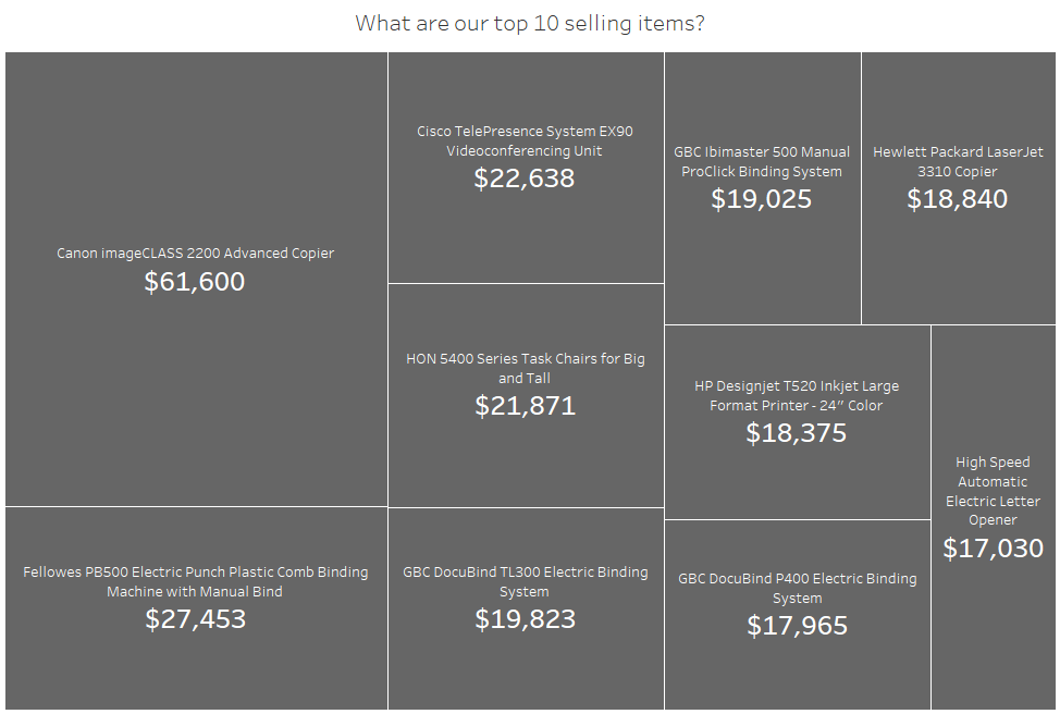
5. Use the “Label” tab in the Marks Card to customize text layout.

6. Use the “Color” tab in the Marks Card to change the background color of the rectangles and make the borders in between them white. This really helps them pop.

Now you’ve got a beautiful, informative tree map that just highlights relevant data.
Need more help? Please contact us at freesupport@onenumber.biz.