
There will be times when building dashboards when you’ll have multiple worksheets that use the same measure on color. It’s best practice to use color consistently throughout your dashboard, but it can also lead to unforeseen complications. Take the below dashboard as an example.

Each of the worksheets on the dashboard is colored by Discount %, but the ranges for the upper end of the color legend vary significantly.
You have a few options at this point:
● Include the color legend for every worksheet
● Only include one color legend
● Build your own color legend
The first option is noisy. There is too much space eaten up on this dashboard by color legends.
The second option means that your users will need to intuit that the range from the single color legend applies only to a single worksheet. I don’t like to assume my end user will understand what I’m doing unless I spell it out very clearly.
This leaves option three as our best alternative.
Here’s how I like to create custom color legends:
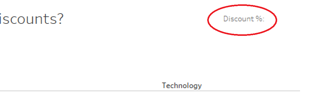
● Add a text box to the right of the title with the color legend name:
● Add another text box to the right of the first and input text like “Low” and make sure it is large, bold, and colored.

● Right-click on the second text box and select “Format text object…”
● Adjust the border so it is large and matches the color of the text.

● Repeat this process for the other end of the color spectrum.
● Add a blank dashboard object to the left side of your title to center it.
Your end product will look something like this:

With a few easy steps, you’ve made your dashboard much more straightforward and visually appealing.
Good luck in applying this to your own dashboards!
Need more help? Please contact us at freesupport@onenumber.biz.