
By: Eric Parker

Eric Parker lives in Seattle and has been teaching Tableau and Alteryx for 5 years. He's helped thousands of students solve their most pressing problems. If you have a question, feel free to reach out to him directly via email.

The Story of the 2018 Season
I miss baseball. I’m a hopeless Mariners fan. I was blessed/cursed to grow up in the 1990s and early 2000s when the Mariners were putting together exciting teams with players like Ken Griffey Jr., Randy Johnson, Alex Rodriguez and Edgar Martinez. Going to those games in the Kingdome with my dad and having them on the television every night in the summer cemented my love for the franchise.
Even though they’ve been lousy for nearly 20 years, I still miss seeing them take the field this spring. They have had plenty of strange seasons over the last two decades, but one of the weirdest was 2018. On Sunday, July 5th, 2018 they were 56-32. That’s 24 games above .500! They were only a few games behind the Houston Astros, noted cheaters and world beaters.
However, all was not as rosy as it seemed. For weeks critics had noted that they had a poor run differential over the course of the season. Run differential is calculated by taking the number of runs you’ve scored and subtracting the number of runs your opponents have scored.
Despite having 24 more wins than losses, their run differential was only +25. That means they only won games by an average of one run. That is a miniscule margin.

If you know anything about the Mariners, you can imagine this story doesn’t end well. By the end of the season they were 89-73 (16 over .500) with a run differential of -34. Life caught up with them. You might say they regressed toward the mean.

Once again they missed the playoffs. Once again, us Mariners fans had to watch other teams in October.
How did this happen? A variety of factors;
● It’s easier to be an outlier when the sample size of data is small. With a run differential of +25 on July 5th, the Mariners might’ve been expected to have a winning percentage of 53%-54%. Instead their winning percentage was nearly 64%.
● The Mariners had an amazing closer (9th-inning pitcher) that year named Edwin Diaz who allowed them to win a lot of games by close margins.
● Some even argued that it was due to human psychology. Robinson Cano was out for the first half of the year with injury and around the time he came back, the team seemed to plummet. On paper, he was a better player than his backup, but sports are a strange world where appearances don’t always translate to reality.
Creating the GIF
The biggest inspiration for this post was wanting to show a visual of the Mariners 2018 season on a scatter plot displaying their run differential versus their winning percentage. Here’s a snapshot of that scatter plot after their 88th game of the year (Sunday, July 5th).

Here’s another snapshot at the end of the season.

See how much the Mariners moved toward that trend line? Give them a few more games and they would’ve kept dropping. ;-)
Thank you to www.baseball-reference.com for the data behind those visuals and my colleague Kirk for teaching me about the IMPORTHTML function in Google Sheets.
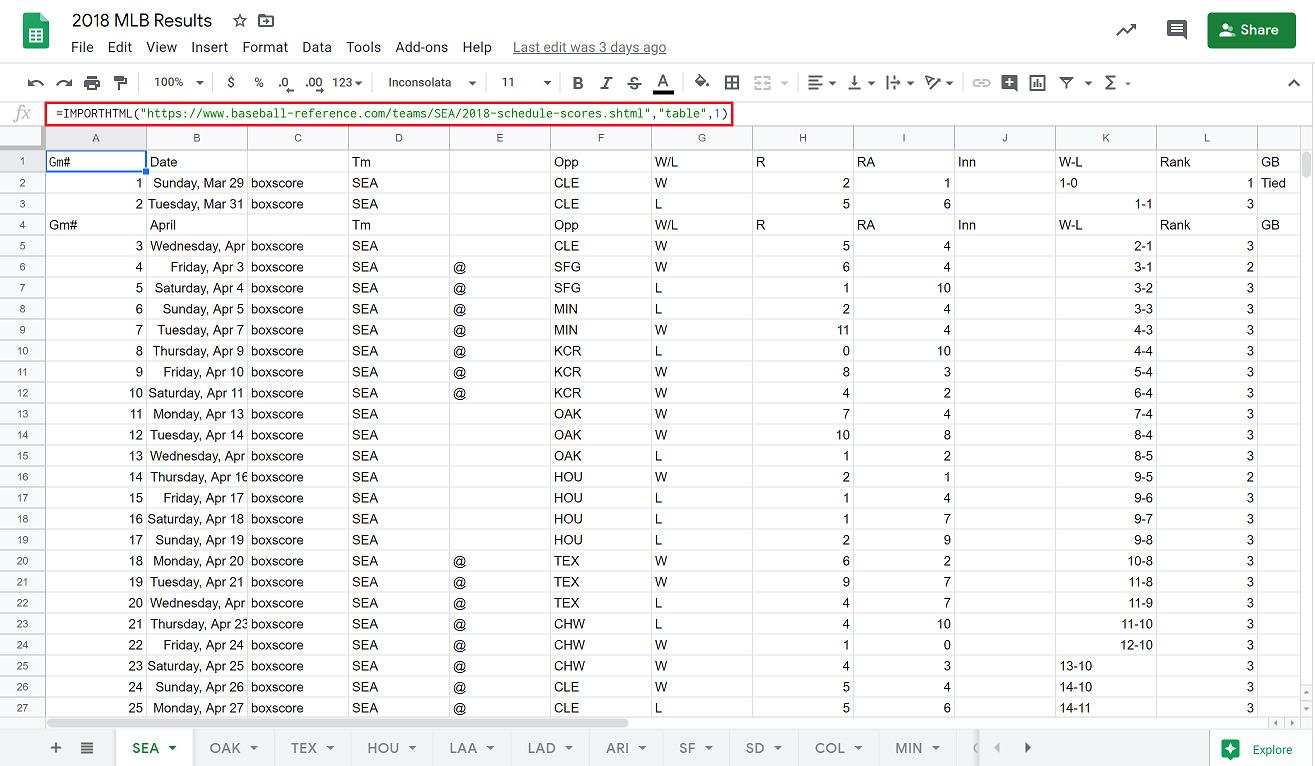
I used the IMPORTHTML function in Google Sheets to pull the table for each team’s 2018 season from baseball-reference.com.

Here’s a GIF displaying the movement of all 32 teams (with the Mariners highlighted) throughout the course of the season.

The GIF was made possible using ScreenToGIF.
To build the visual, I started by creating a Scatter Plot with Winning % on Rows and Run Differential on Columns.

You’ll notice that [Tm] and [Gm#] on Detail and highlighted the Mariners.
Both the Run Differential and Winning % fields utilize RUNNING functions which means they will build from one game to the next. (e.g. if you win your first game you are 1-0 and have a 100% winning percentage. Then, if you lose your next game you are 1-1 and now have a 50% winning percentage.)
(Note: setting these Table Calculations up correctly took a bit of “Specific Dimensions” magic as well).
The Run Differential Calculation:

The Winning % Calculation:

The biggest trick to creating the GIF is utilizing the Pages shelf. I added the [Gm#] field to the Pages shelf and you can then utilize the play button on the Pages dialogue to let the visual build itself throughout the course of the season.

Well, I hope this lifted your spirit much in these tough times and maybe you learned something new; about the Mariners, Tableau, Google Sheets, or maybe even all three!
Interested to build something like this for yourself or learn more about the process? Shoot me an email or sign up for an office hour and we can build together!
Stay safe all!