
By: Eric Parker

Eric lives in Seattle and has been teaching Tableau and Alteryx for 5 years. He's helped thousands of students solve their most pressing problems. If you have a question, feel free to reach out to him directly via email.
Bar charts are widely recognized as one of the best visualizations for communicating data. They help to rank, sort and compare values easily. Sometimes, situations arise in which you’d like to see a bar charts broken down so that each row of data is a single square that contributes toward a total bar.
For instance, a couple years ago, I built some dashboards about how dangerous it is to climb Mount Rainier. During the investigation I pulled data on deaths that occurred from climbing incidents at Mount Rainier National Park. To get a feel for when these deaths occurred and what caused them, I created a dashboard with individualized bar charts.

The power of the individualized bar chart is the ability to hover over any data point and uncover details about that point.

Let’s try to create a similar visual using Superstore data.
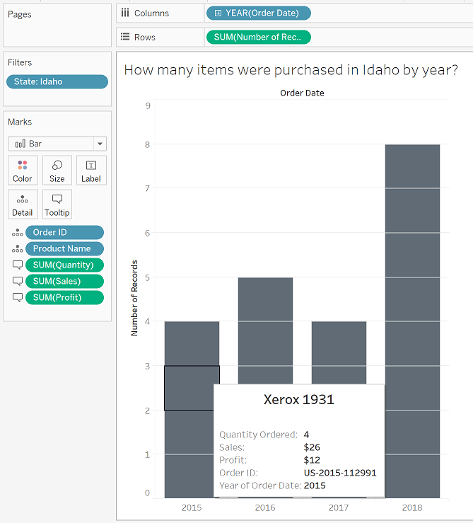
Imagine the question we are answering is, “How many items were purchased in Idaho by year?”. We might start by creating a bar chart showing Number of Records by Year with the worksheet filtered down to Idaho.

From here, we would want to put a unique identifier like “Row ID” or “Transaction ID” on Detail in the Marks card.

Placing Order ID breaks the data down a little bit, but some orders contain multiple items so we need to add Product Name to detail as well to see a unique square for each product from each order.

Finally, by customizing the tooltip, we can learn about what each row represents.
Want help with your own visuals? Reach out to set up an office hour and we can tackle them together!