
By: Eric Parker

Eric Parker lives in Seattle and has been teaching Tableau and Alteryx for 5 years. He's helped thousands of students solve their most pressing problems. If you have a question, feel free to reach out to him directly via email.
Have you ever had an asterisk (*) returned in place of a value in Tableau? This unexpected behavior is the result of what’s called the Attribute function (ATTR). We’ll look into it more here.
Seeing as it’s nearly spring which is when baseball gets underway, we’ll use some baseball data for our example. We’ll be looking at yearly statistics for Justin Verlander (better known to some as Kate Upton’s husband). Last year, he was traded from the Detroit Tigers to the Houston Astros in the middle of the season. You’ll see how that comes into play in a moment.
I am going to answer the question “Is Justin Verlander’s win % increasing as he ages?”. Here’s what our data looks like:

Notice there are two rows of data for 2017. Every other year only has one row.
Here is my initial chart (excluding 2005 for only being 2 games):

So far so good. Now let’s say I want to put the team field on tooltip so you can see which team he was pitching for during those different seasons. When I do that Tableau wraps the field in the ATTR function. Things look fine in the tooltip for years he was only on a single team.

However, for 2017 we get an asterisk. What’s going on?
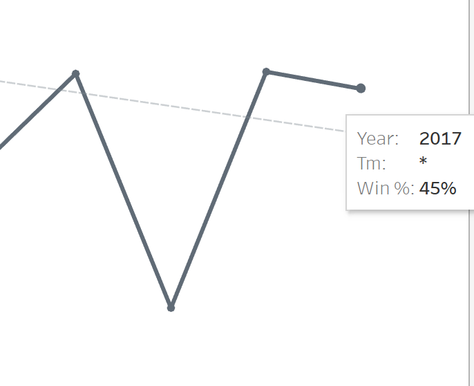
Attribute is an aggregation function for text-based fields. If there is only a single value for the level of detail you are viewing your data at, it will return that value. If there are multiple values, it will return an asterisk.
Wait a minute, what?
Consider our data and that for every year other than 2017, Verlander only pitched for the Detroit Tigers. Part way through the 2017 season he was traded to the Houston Astros. Here’s what the data looks like broken down:

When the ATTR function is applied, imagine some logic like this is going on behind the scenes:

Because end users aren’t always deeply technical and an asterisk won’t necessarily mean something to them, I often create my own calculated fields to return a custom message when there are multiple values.
For instance:

When I apply that calculated field to the tooltip in our original visual the result looks like this:

Need more help? Book an hour of expert Tableau help for your project!