
By: Eric Parker

Eric Parker lives in Seattle and has been teaching Tableau and Alteryx since 2014. He's helped thousands of students solve their most pressing problems. If you have a question, feel free to reach out to him directly via email. You can also sign up for a Tableau Office Hour to work with him directly!
So you want to build a market depth chart in Tableau. huh? Let’s start by quickly defining the purpose of a market depth chart and then we’ll look at the steps for how to build one in Tableau.
What is a Market Depth Chart?
A market depth chart allows traders (and those interested in asset markets) to understand supply and demand. It plots unexecuted trades against the current price of an asset so viewers can understand what price level would entice more sellers to liquidate their positions and what price level would encourage more buyers to buy.
You’ll commonly come across these charts in investing platforms. That includes applications and websites which allow you to trade stocks, commodities and even cryptocurrency.

● The left (green) side of the chart represents the quantity of outstanding bid/buy orders.
● The right (red) side of the chart represents the quantity of ask/sell orders.
● The x-axis represents the price of the asset in question.
● The middle of the depth chart where the green and red section meet each other (most often) represents the price of the asset at the last executed trade.

If the center point of the demand is skewed toward either extreme, that generally indicates some of the following:
● Demand and supply of the asset are uneven
● The interest of buying and selling isn’t concentrated around a set price. This often means the asset will see price volatility in the near future.
More depth (i.e. open orders on both sides of the orderbook) and even distribution of depth indicate that an asset can sustain larger/more orders without significant price volatility.
More depth on the right (red) side of the graph (Sell Walls) represents eagerness from current asset holders to sell above the current price.

More depth on the left (green) side of the graphs (Buy Walls) represents eagerness from prospective buyers to attain the asset below the current price.

How to Build a Market Depth Chart in Tableau
Now that we’ve covered the basics of market depth charts, let’s walk through how to build one in Tableau.
The first steps you want to perform to set the stage is to add any necessary filters to your worksheet.
Here are some examples of filters you might need to add:
● Asset: XYZ
● Date: Today
● Order Status: Open
The mock data I’m working with contains only unexecuted orders from a single day. Your real data will probably be more complex and require more filters.

Next, we’ll add the [Order Price] field to the Columns shelf. Once the field is added, we’ll format it to be a Dimension and Continuous.

Then, the quantity field [Order Units] can be added to the Rows shelf. The mark type should be converted to bar. These bars make up the backdrop of the depth chart (if desired).

Next, we must create calculations for the Bid and Ask sides of the depth chart.
Here is a calculation for [Bid Quantity Below Last Price]

And here is a calculation for [Ask Quantity Above Last Price]

Next we can add the [Ask Quantity…] calculation to the Rows shelf and set the mark type for the field to Area.

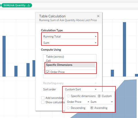
After that, we will add a table calculation to the [Ask Quantity] field (hint, right-click the Ask Quantity pill and select “Add Table Calculation) to turn it into a Sum of Running Total running left to right (ascending by Order Price).
Now, we need to do something similar for bids.
The bid field can be dragged and dropped directly on the Ask field axis to create a shared axis chart.

We’ll add a running sum table calculation to the bid field which sums right to left (Order Price, Descending).

Now, we just need to do some minor formatting!
Hide the null indicator.

Turn the worksheet into a dual axis visual so the area charts can layer on top of the bar charts.

Synchronize the axes.

Add the [Last Trade Price] field to the Detail tab on the Marks card and then create a reference line displaying the last trade price (hint, right click on the Order Price axis and select “Add Reference Line”).

Add the [Measure Names] field to the Color tab on the Marks card to turn the Asks red, Bids green and bars gray (if you want).
When all that is done, you should end up with a market depth chart like this!

Got stuck, have questions or want help on your own project? Feel free to shoot me an email or sign up for an office hour to work together!
Sources: