By: Eric Parker
Eric Parker lives in Seattle and has been teaching Tableau and Alteryx since 2014. He's helped thousands of students solve their most pressing problems. If you have a question, feel free to reach out to him directly via email. You can also sign up for a Tableau Office Hour to work with him directly!
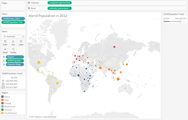
I recently received an email from a blog reader who was trying to solve a problem I’ve come across several times. He was representing populations on a map of the world in a chart that looked something like this.
As you can see, there are a few different sizes of circles on this map representing varying population sizes of countries in the world. One of the problems of utilizing Tableau’s default sizing is that when we adjust the filter so the worksheet only includes countries of a certain size, the shapes re-adjust to fit the data.
By filtering out any country above 1,000,000,000 people, you can see that while previously the largest circles represented only India and China, there are now numerous large circles representing countries including the United States, Brazil and Indonesia.
One possible solution to this problem is through custom shapes.
I created a custom shape palette with PNGs representing four different sizes of circles.
Then I created a calculation to break the population sizes into four buckets.
Next, I changed the mark type of the worksheet to Shape and chose the Circles palette from a couple steps ago and matched up the outputs to the proper shapes.
The Population field can now be removed from the Size tab in the Marks card so there are four distinctive sized circles.
And now the best part is that even if the filter is updated, the remaining circle sizes remain the same as before.
Please check out our upcoming classes and office hours if you are looking to dive even deeper!


