By: Eric Parker
Eric Parker lives in Seattle and has been teaching Tableau and Alteryx since 2014. He's helped thousands of students solve their most pressing problems. If you have a question, feel free to reach out to him directly via email.
You’ve probably seen one of those graphs where a thermometer gets filled in to demonstrate progress toward a goal. They are popular on fundraising sites. It’s possible to create that same kind of visual in Tableau but requires a little ingenuity.
Let’s walk through an example. Imagine you are part of a charity effort that is trying to raise $50,000 to build a school overseas. You want to create a Tableau dashboard to demonstrate your progress. One of the visuals at the top will be the shape of a school filled in with progress toward 100% of the goal.
The first thing to do is find the image/shape you want to fill in! Unless you have extensive photoshop experience, I recommend picking a simple shape which is a single color and completely connected (e.g. no split into two or more separate pieces).
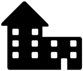
Here is an image that will work well (thanks Noun Project!)
And here is one that would provide more difficulty (because it’s broken out into several distinct shapes).
The next step is to make the shape transparent. If you have Photoshop or another editing tool that makes that simple, have at it! I’m a simpleton and don’t have access to those tools so I use a simple online image editor instead. The program is called LunaPic and is free. You can access the direct link to where to upload an image for transparency here.
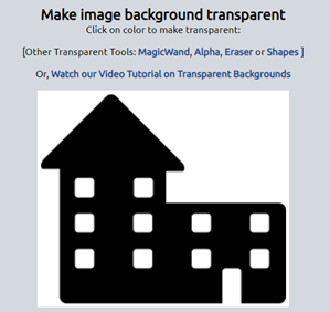
The first step on LunaPic is uploading the image you want to edit.
Next, you need to select the color you want to make transparent. LunaPic does this well when the shape is a single, solid object. In my experience, it hasn’t worked great for multi-shape objects.
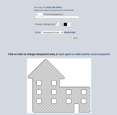
After selecting the color you want to make transparent, you will see something like this.
You can download your edit as a PNG which you will use later in a Tableau dashboard.
*Try to avoid what I did the first time I created a transparent background! I didn’t realize the PNG I used already had a transparent background. That meant that not only was the school outline transparent, but also all the background space was transparent too. Doh! I copied the shape into a Word document and used the Snipping Tool to create a new PNG with a solid white background, and used that shape in LunaPic instead.
The first step after loading your data in Tableau is to create a bar chart which demonstrates the current value and gap toward the goal. Here’s what mine looks like:
It’s a stacked bar with two measures: Donation Amounts and Remainder (Tableau calculation).
There are a few formatting changes I’ve made as well to make this more usable for our purposes:
● Hid the Axis
● Removed Grid Lines
● Removed Zero Lines
● Moved the size slider in the Marks to the furthest right possible
Now you’ll want to design your dashboard and figure out roughly where the filled in shape is going to go. Getting the transparent image to fit just right is a tedious process so I recommend trying to get everything else set up exactly where you want it before bringing that image in.
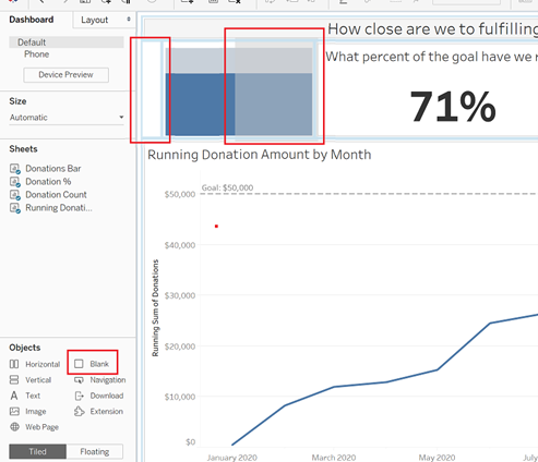
For instance, you might have something like this.
I will often bring in a blank object on either side of the bar chart which will help with minute changes and spacing later.
Now we can drag in the transparent shape as a floating Image object. Make sure it is fit and centered for the best experience!
Now the final step is to line it up just right with the bar chart so that it overlaps.
Looking for help with your own Tableau project? Book a Tableau Office Hour!


