
By: Lindsey Elhart

Lindsey is a senior data analyst at Fred Hutchinson Cancer Research Center in Seattle. She has been working in similar roles for several years and is passionate about effective visualization and sharing of data. On weekends she can be found attending local speaker series or finding new routes to run, and you can check out her Tableau Public profile here.
As Steve Jobs shared, “… [Design] is not just what it looks like and feels like. Design is how it works.” Most Tableau-related content focuses on the technical “how-to’s”. It’s easy to spend a lot of time trying to get calculations and visuals to work correctly and neglect to spend ample time on how a dashboard will be used and how it should be presented to end users. Involving others in the development process and putting time and thought into the formal handoff will improve adoption and smooth the transition from old processes.
Step 1: Get to know your presentation options:
● Click the Presentation Mode button in the upper right to hide the Tableau environment. Once selected, there are options in the bottom right corner of the screen to show a Filmstrip (thumbnails of each sheet) or show Tabs . To exit, click the Presentation Mode button again or press the Escape key
Presentation Mode button

Working with Presentation Mode

● The Story option is helpful when it is important to walk viewers through the data discovery process in a scripted way. Stories can combine dashboards in the same way that dashboards combine worksheets. Give yourself extra time to assemble your Story so each caption introduces a greater level of detail while maintaining a logical flow.
Story example

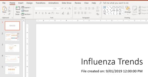
● The Export to PowerPoint option is useful when slides are customary to the work culture. This functionality is only available with Tableau version 2019.1 and forward. For each dashboard, adjust the size to “Fixed Size: PowerPoint,” then navigate to File > Export as PowerPoint. The output will consist of a title slide with the file name and last modified date, as well as a slide for each dashboard and sheet.
Sizing a Dashboard for PowerPoint

Exporting Tableau visuals to PowerPoint

How the visuals will be formatted in PowerPoint
Helpful note: Tableau workbooks are not backwards compatible. I find it helpful to run two versions: the most recently released and the version that follows my company’s Tableau Server (e.g. 2018.2). This builds my comfort in the newest features (eg export to PowerPoint), while developing in the version that I can easily publish to Tableau Server and share with my colleagues. In the case above, I would open my 2018.2 file in Tableau Desktop 2019.2 to take advantage of the PowerPoint functionality, and then if needed select ”File > Export as Version” to revert the file back to 2018.2 for publishing to Tableau Server.
Step 2: Test out the display in the conference room used for the presentation:
● Ensure the dashboard is the right size for the screen. It is irritating when an axis is cut-off, or a scroll bar limits the audience from seeing the full view. The default Fixed Size is a safe bet. Dashboard objects will remain in consistent locations and proportions. Another bonus with this approach is that fixed dashboards load faster on Tableau Server due to caching.

● Sit in the seat farthest from the screen to ensure all text is readable. This includes titles, axis, and tooltips.
○ If you find the formatting needs to change on several worksheets, use the Copy and Paste Formatting option. All settings in the format pane are carried over, minus reference lines and annotations. Right click on the sheet or dashboard with the updates > Copy Formatting > right click on the target sheet > Paste Formatting.

Step 3: Practice:
● No dashboard or presentation is perfect the first time; it takes other opinions, fresh perspectives, iteration, and adapting to a variety of questions to improve the depth and quality of your product
● Use minimal mouse movement as the audience tracks it naturally and it can distract from the presentation
● Linger on dashboards and tooltips, as the audience may be seeing and processing certain details and ideas for the first time
Check out the next blog post for the final part of this series.
The views expressed are my own and not those of Fred Hutch as an institution.