
By: Eric Parker

Eric lives in Seattle and has been teaching Tableau and Alteryx for 5 years. He's helped thousands of students solve their most pressing problems. If you have a question, feel free to reach out to him directly via email.
I’ve seen several examples of people turning their resumes into Tableau dashboards recently and I wanted to try my hand at it and write a blog post about the process.

(Click image to interact with dashboard on Tableau Public)
Special thanks to these dashboards for inspiration:
● My Interactive Resume (Helena Dantas Pires)
First, it all starts with the data (as always).
I knew there were 5 main components I wanted to visualize:
● Education and Work History
● Product (Technical) Skills
● Areas of Proficiency
● Certifications
● Links to my Resources
To create the data source, I created an Excel with a single sheet for each area of focus listed above (five total). I scraped the information off my past resumes and my LinkedIn page.
Here are what those five sections look like.
Worksheet #1: Education and Work History

Worksheet #2: Product Skills

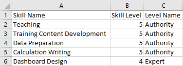
Worksheet #3: Areas of Proficiency
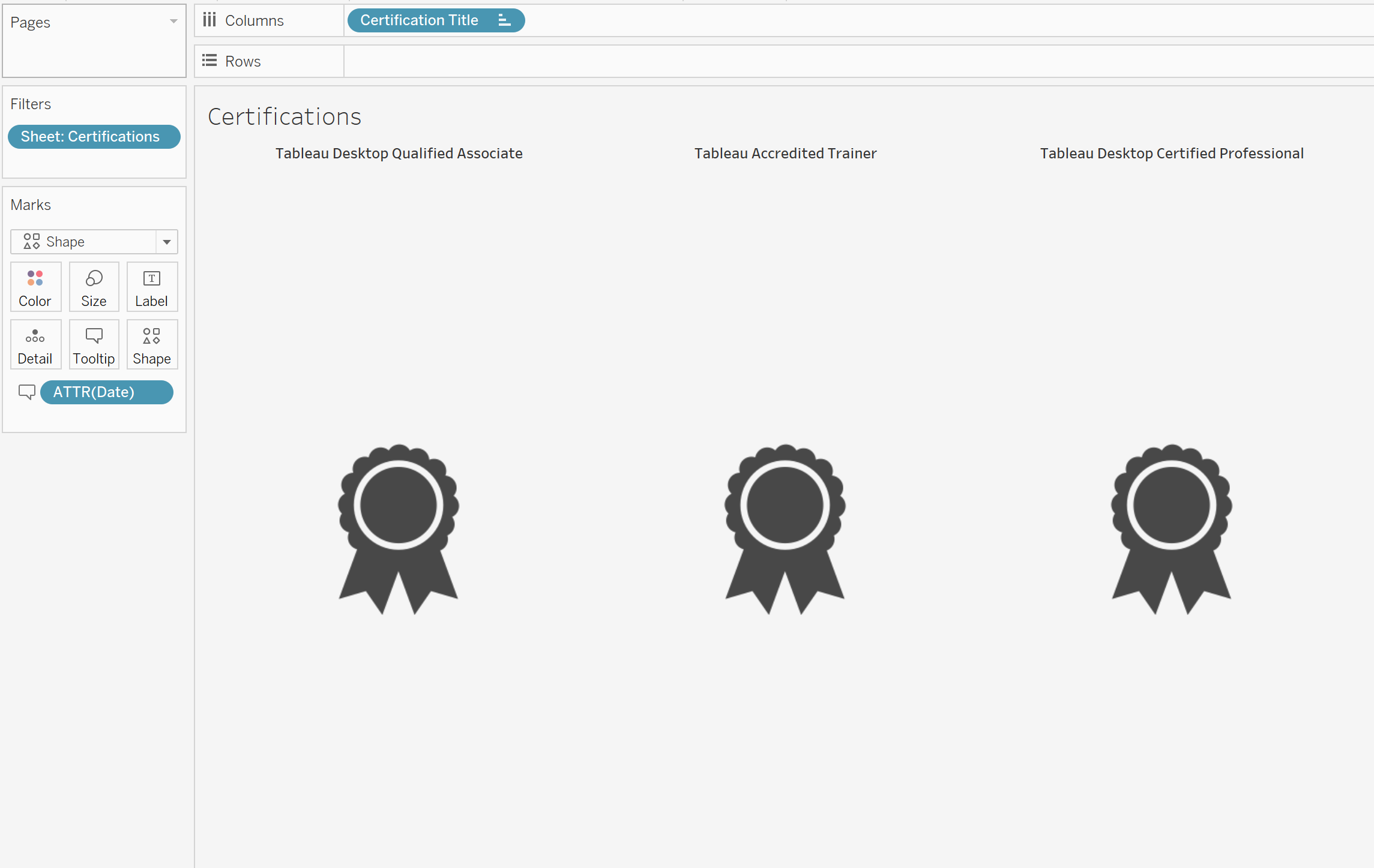
Worksheet #4: Certifications

Worksheet #5: Resource Links

Each of those five sheets were unioned together in the Tableau Data Source page.

Each of the Excel sheets was used to create an individual worksheet that was used in the final dashboard.
Education and Work history was turned into a gantt bar chart. If you’re looking to create something similar, check out this helpful tutorial on YouTube.

Certifications was turned into a worksheet utilizing custom shapes.
Links to Resources was also turned into a sheet using custom shapes. It is important that the URL field is listed in the Marks card since it is used in a URL action in the dashboard.

Product skills and areas of proficiency were both turned into lollipop charts (dual axis bar and circle).

And, of course, it wouldn’t be one of my dashboards without an info button.
The rest of the work revolved around dashboard design (getting an image, floating a transparent circle over it, making the background light gray, etc.).

If you too want to turn your dashboard into a visual resume, go for it! You can access and download the dashboard on my Tableau Public page and I’ve uploaded a copy of the Excel file to my Google Drive which you can access here. Those should provide a good starting point for your own dashboard.
As always, thanks for following along! If you ever need help you can reach out directly (email can be found in the Tableau resume) or book an office hour so we can solve your most pressing problems together!