
Take a graph like the following:

Let’s say you want to visually distinguish the 5 days with the lowest profit ratio. I’ll show you how I prefer to approach situations like this.
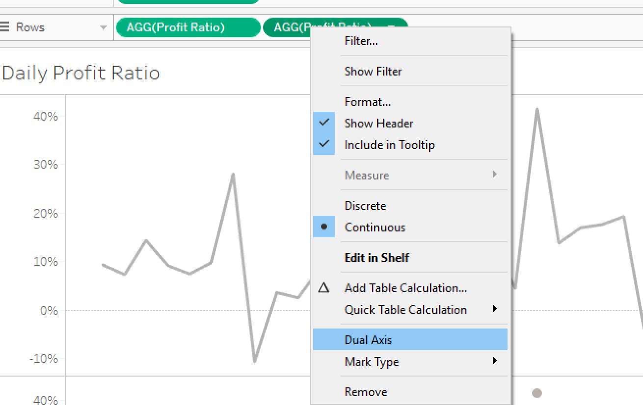
First, I drag another copy of “Profit Ratio” to Rows so that I’ve got two identical graphs.

Next, I change the mark type in the second graph to “Circle”.

Now, we need to create a calculation that changes the bottom 5 points into a different color than the rest. Here’s the calculation I use:
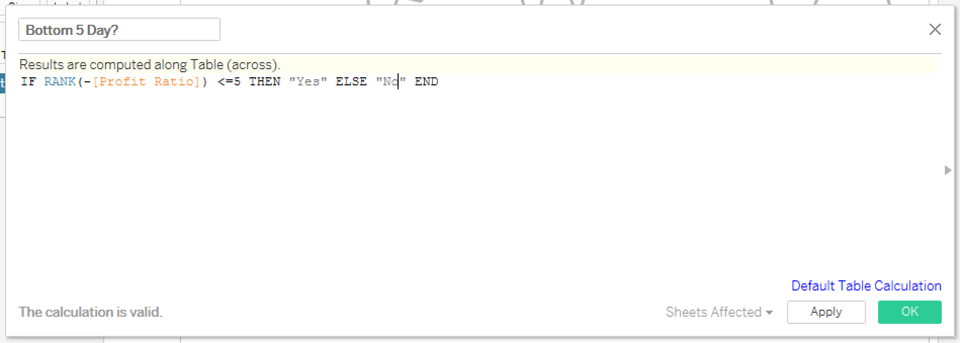
Here’s what the calculation is doing. Rank compares each points to all the other points. By default, the point with the highest value is given a rank of “1”, the next highest “2”, and so on. However, in this case, we want to ensure we are only highlighting the bottom 5 days, so we will actually reverse the ranking so that the lowest value is “1”, the next lowest “2”, and s on. We do that by adding the “-” sign before Profit Ratio inside the Rank function.
After completing the calculation, drop it on “Color” in the Marks Card for the Circle section and you should get this:

The last step is to create a dual axis visual and do any formatting changes you want.
The final outcome will look something like this:

Need more help? Please contact us at freesupport@onenumber.biz.