
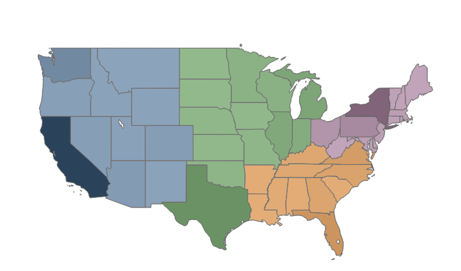
I was given a challenge by a student recently. They wanted to color territories on their map by a region, but they wanted the intensity of the color to represent the amount of sales that occurred in an individual territory.
Essentially they wanted to create this:

The primary question was, how do you get there?
Overlaying Two Maps
We’ll start with a map that just has region on color:

From there, we’ll create a duplicate of “Latitude” and drop it next to Latitude on rows (Hint: use CTRL + drag to create a copy of a field that’s already being used in your worksheet).

Select the second label of “Latitude” in the Marks Card, drop “Sales” on color, and set the color scheme to sequential going from white to black.
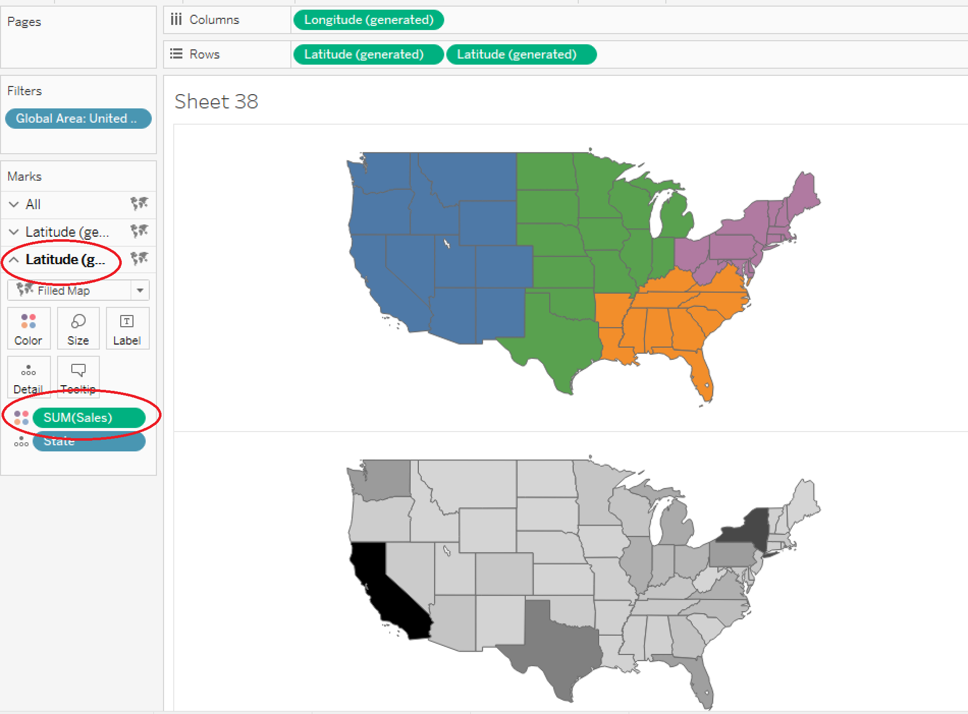
Drop the opacity of the map down to around 50% so the black looks more like dark gray.

Right-click on the second “Latitude” on Rows and select “Dual Axis”.

At this point, you should have a beautiful map that is colored by both a dimension and a measure.
Need more help? Please contact us at freesupport@onenumber.biz.