
By: Eric Parker

Eric lives in Seattle and has been teaching Tableau and Alteryx for 5 years. He's helped thousands of students solve their most pressing problems. If you have a question, feel free to reach out to him directly via email.
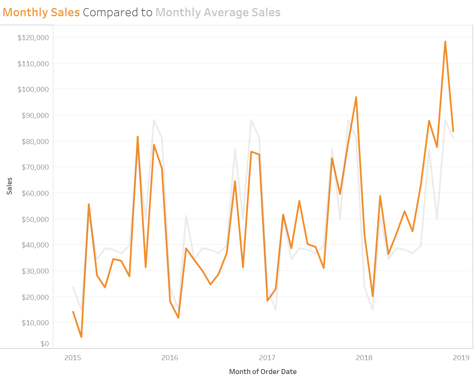
I was recently asked by a student how they could compare several years of monthly values to the monthly average over that time span. They had something like this in mind:
The calculation to create the monthly average requires multiple FIXED, Level of Detail expressions. It looks like this:

The 2nd line ({ FIXED MONTH([Order Date]),YEAR([Order Date]):SUM([Sales])}) calculates a unique sum of sales for each Month/Year combination.
The 1st and 3rd lines ensure that those values are averaged at a monthly level, independent of year.
(If you need a refresher on how the FIXED function works, check out this blog post.)
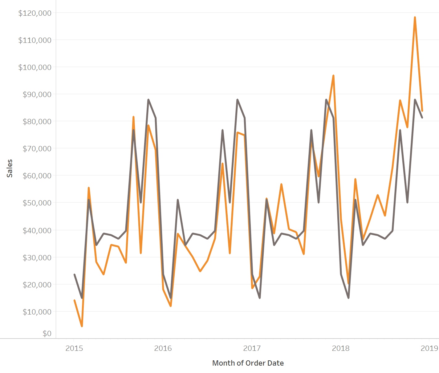
When you create a chart with multiple lines, having them both leverage the same amount of color saturation can be distracting.
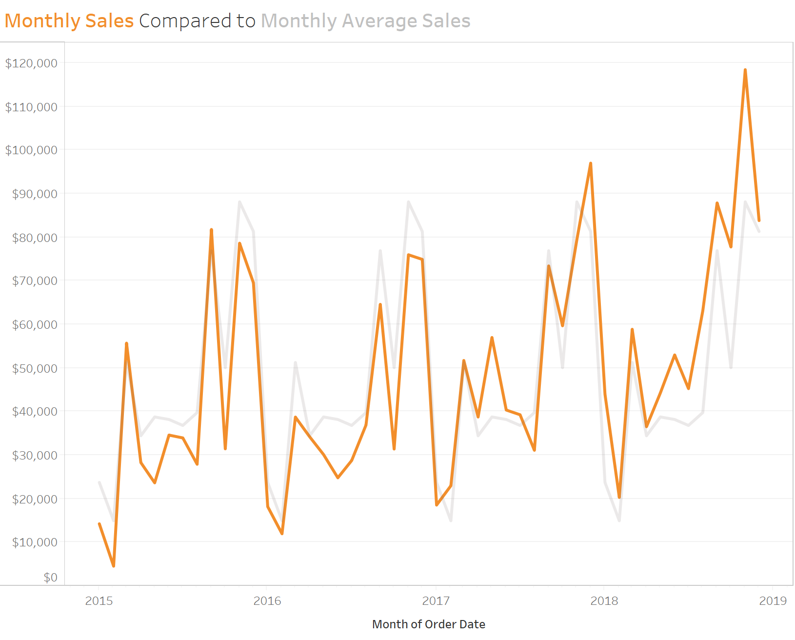
That’s why I decided to create the chart from the first image as a dual axis.
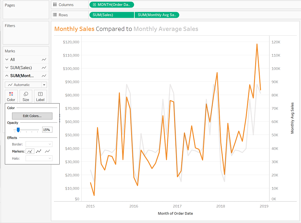
By creating a dual axis chart, you have the ability to turn the opacity down on a single line without making them both transparent.
The last steps are to ensure the axis on the right side is synchronized with the left axis and after that it can be hidden.
Need help with your own calculations? Sign up for an office hour and we can help you out!